|
|
Post by DriftingRedDevil on May 23, 2007 15:03:04 GMT
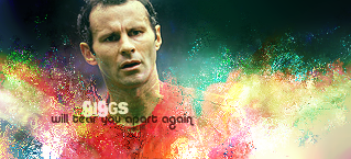
Took one of Redoms old sigs and added stuff to it for a photo montage project at my school, to make it my own... sort of. Tell me what you guys think.   |
|
|
|
Post by redom on May 23, 2007 17:16:17 GMT
I don't wanna lie to you so honestly I don't like it that much, the effects on the giggs pictures you added area bit too overbearing on the whole, though some of them look good up to a point and would work better with a few tweaks (maybe could have left the faces free of the colour distortion/shiny effect thing). I like the way you've tried to fit the number 11 pic into the bg of the pic and I'd definately encourage you to keep going and experimenting with ideas but I'm not really feeling this one, sorry mate  , kudos on the effort though |
|
|
|
Post by Rais.n.Hell on May 23, 2007 17:43:48 GMT
Same here bro... sorry but dont wanna lie to you...he is right too many effects and the picture on the right with white distorted dots is not as good as it could be...but i must say it is a great effort and i see where you want to do with this...but smoother the picture with least distractions the better...i hope u see what i am saying... |
|
|
|
Post by RedArmy20 on May 23, 2007 21:24:42 GMT
what ever redom said!, i like it a bit though  , maybe just a bit too much effects. |
|
|
|
Post by DriftingRedDevil on May 24, 2007 2:17:59 GMT
Yeah honestly guys I agree with you there is wayyyyyyy to many effects. However, it was for school and I had to meet the requirements of 6 pics with all of them having at least one filter. and the filter couldn't be the same  It was a quick easy project but annoying at the same time. I dunno I like some of the effects I used but I had to meet requirements soooooooo its not that good I agree |
|
|
|
Post by RedArmy20 on May 24, 2007 10:59:16 GMT
i like the effect on giggs with vodafone shirt, that one was good
|
|
|
|
Post by DriftingRedDevil on May 24, 2007 22:42:18 GMT
This one I did for a clan that I'm in now called BoG Ragnarok. The colors I used are the colors of our clan. This one I like but I wasn't sure what to do with the text. Feedback anyone?  |
|
|
|
Post by RedArmy20 on May 24, 2007 22:44:40 GMT
the text is the only thing that doesnt look good on it, but the pic is great, just change the text |
|
|
|
Post by DriftingRedDevil on May 24, 2007 22:47:24 GMT
haha yeah, I did the entire picture and then I was like ummm...... shit..... so I threw the text in there. Do you like the font and not the color or should I change the entire thing? Because Ragnarok comes from Norse myth so I thought the font looked a bit norse-ish?
|
|
|
|
Post by RedArmy20 on May 24, 2007 22:58:25 GMT
haha yeah, I did the entire picture and then I was like ummm...... shit..... so I threw the text in there. Do you like the font and not the color or should I change the entire thing? Because Ragnarok comes from Norse myth so I thought the font looked a bit norse-ish? the font looks quite ok, you maybe should get a 3d text from the internet or something with the same font but with some special effects to make it look better, |
|
|
|
Post by DriftingRedDevil on May 24, 2007 23:00:25 GMT
I would but unfortunetly I don't have photoshop at home yet  I only do this stuff at school and I dont' have school anymore so I have to find a way to get it. |
|
|
|
Post by redom on May 24, 2007 23:11:46 GMT
The text looks a bit pixelated/rough and would look better just smoothing the edges: when using PS make sure you have one of the options from this menu selected, except "none".  this picture show the difference between the edges of the none option and the crisp option  see how the one with "none" selected has rougher edges? just a quick tip |
|
|
|
Post by DriftingRedDevil on May 25, 2007 0:31:53 GMT
hmmm didn't think about that at the time. What do you think of the picture itself though Redom?
|
|